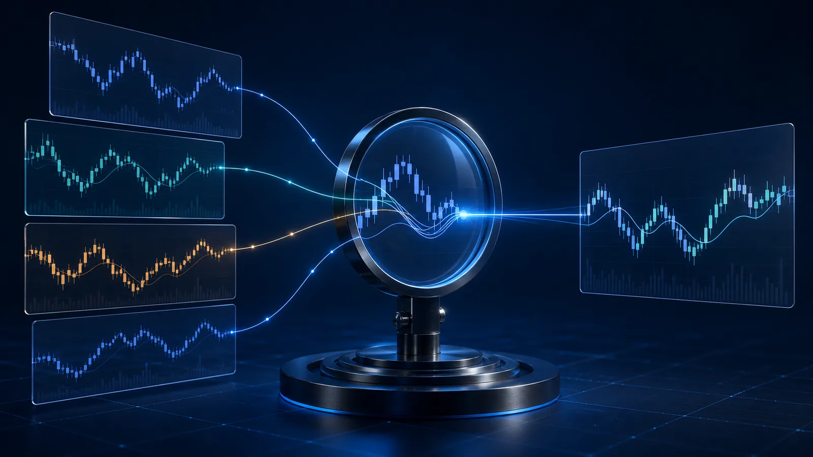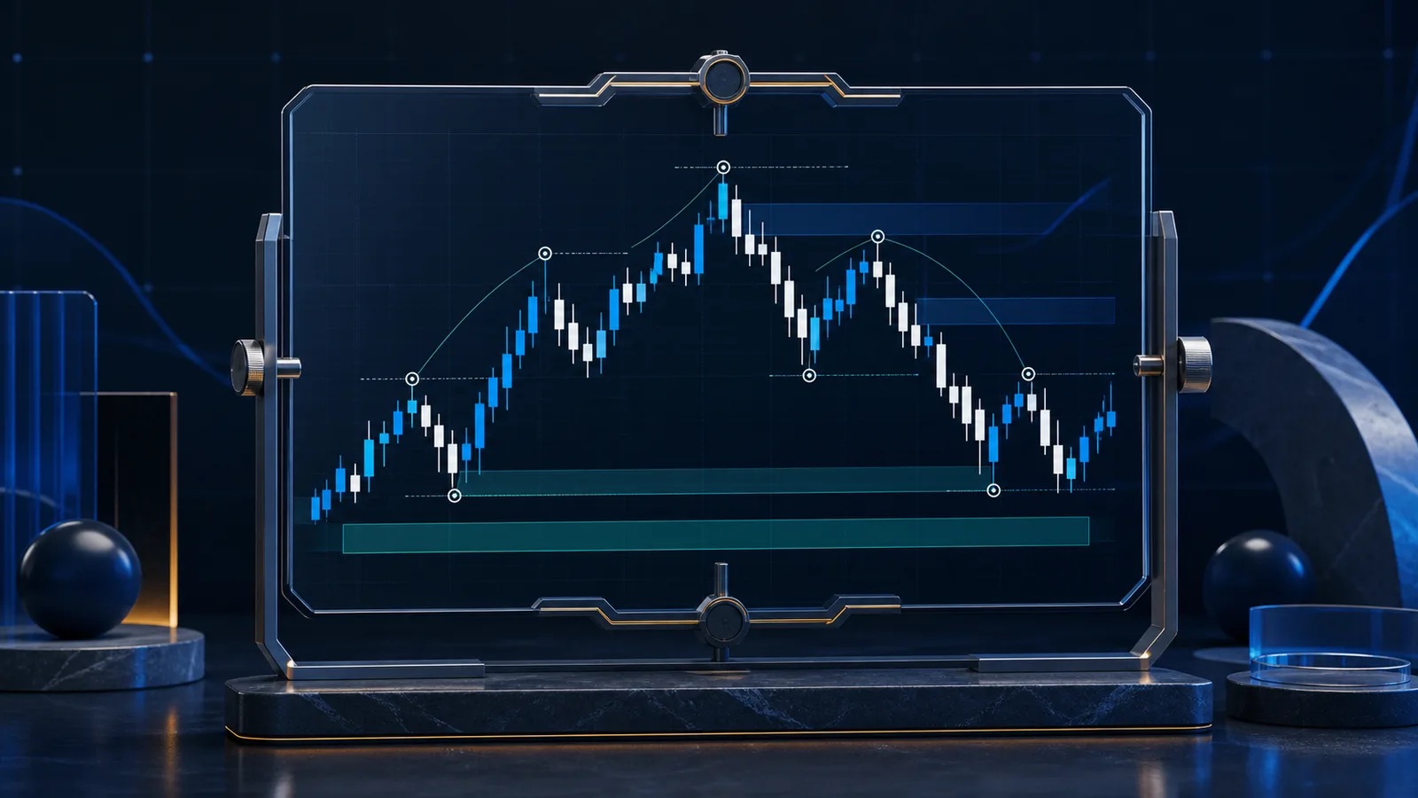

A crypto chart timeframe is the amount of time summarized by each candle or data point. A four-hour candle condenses four hours of trading into values such as open, high, low, and close, while a daily candle summarizes a day. The right timeframe is the one that matches the research horizon, data quality, and decision frequency—not the one that makes a preferred pattern look clearest.
Candle interval versus lookback window
Two controls shape a chart. The interval determines how much time each observation represents. The lookback window determines how much total history appears. A chart with 120 one-hour candles covers roughly five days, while 120 daily candles cover roughly four months. Both contain 120 points, but they describe different market horizons.
This distinction is essential in pattern research. A 60-candle formation is not a fixed unit of calendar time: it represents two and a half days on an hourly chart, 10 days on a four-hour chart, or about two months on a daily chart. Recording only “60 candles” makes a study difficult to interpret or reproduce.
Candle construction also matters. The open is the first recorded trade in the interval, the high and low are its extremes, and the close is the last recorded trade under the data provider's convention. Providers can use different venue inputs or candle boundaries. A continuous market has no universal closing bell, so daily candles should be aligned to a stated time standard.
What common timeframes tend to show
Minute and hourly charts preserve short-lived movement and can be useful for studying intraday structure. They also magnify bid-ask effects, isolated trades, venue differences, and gaps in data collection. A long sample at this resolution can be computationally large and may reflect changing market microstructure.
Four-hour and daily charts reduce some short-term variation and are often easier to use for swing-level or broader pattern research. Weekly observations compress the record further, giving greater emphasis to long cycles but leaving fewer data points for newer assets. Compression is not automatically better or worse; it changes which movements remain visible.
A useful way to think about interval choice is as a filter. Higher-frequency data retains detail, while aggregation smooths much of that detail. Once data is aggregated, the exact path inside a candle cannot be reconstructed from its open, high, low, and close. For example, a candle does not reveal whether its high occurred before or after its low.
A repeatable timeframe selection process
- State the question. Are you studying intraday reactions, multi-day formations, or long market phases? The question sets the relevant calendar horizon.
- Set the observation interval. Choose an interval fine enough to represent the behavior without adding detail that the research cannot reliably interpret.
- Set the lookback. Include enough observations to define the pattern and enough earlier context to understand the path into it.
- Check data coverage. Confirm that the asset and venue history are sufficiently complete at that resolution.
- Freeze the specification. Record the interval, boundary convention, price field, lookback length, and any exclusions before comparing outcomes.
For historical searches, the query and candidate windows must use the same interval. The historical chart pattern matching guide covers normalization, selection, and review in more detail.
Worked example: one move, three views
Imagine Asset B rises from an indexed value of 100 to 112 over 12 days, falls to 104, and then settles near 108. On a daily chart, the move appears as 12 observations with enough detail to show several pauses. On a three-day chart, it becomes four candles; the direction remains visible, but much of the internal path disappears. On a one-hour chart, it becomes hundreds of observations, including small reversals that may not matter to a multi-week research question.
A researcher studying 10-to-20-day structures selects daily candles and a 50-candle lookback. The weekly view is used only to label the broader backdrop, and the four-hour view is used to inspect whether one unusual daily print came from a brief spike. The main comparison and its historical candidates remain daily. This preserves a consistent unit of analysis.
If the researcher instead searches daily, four-hour, and hourly windows and reports only the interval with the most compelling analogue, the result is vulnerable to selection bias. A better report records all preplanned variants and explains whether conclusions change across them.
Limitations and common mistakes
Multi-timeframe confirmation can sound stronger than it is. Adjacent timeframes are derived from the same underlying trades, so agreement between them is not fully independent evidence. A daily uptrend and a weekly uptrend may be two summaries of the same movement rather than separate signals.
Other mistakes include mixing UTC-based candles with locally aligned candles, comparing spot data with a different derivative market without labeling it, ignoring missing intervals, and using incomplete current candles. A still-forming candle can change before its interval ends and should not be treated like a completed historical candle unless the research explicitly models partial periods.
No timeframe removes uncertainty. Short intervals can create false precision; long intervals can hide material variation and leave a small sample. Results also depend on the chosen price field: closes emphasize endpoints, while high-low ranges retain extremes but not their order. Document these limitations and avoid turning descriptive patterns into directional certainty.
To explore historical patterns under a consistent chart specification, visit AmarDeFi's Chart Prediction research product. Its comparisons are best used as evidence to examine alongside independent analysis, not as financial advice or a guarantee of future movement.
Frequently asked questions
What is the best timeframe for crypto charts?
There is no universal best timeframe. Select one that corresponds to the behavior and calendar horizon being researched, then confirm that the available data is reliable at that interval.
Is a lower timeframe more accurate?
Not inherently. It supplies more granular observations, but those observations may include more noise, execution effects, and data inconsistencies. More data points do not automatically produce a more reliable conclusion.
Can I compare a four-hour pattern with a daily pattern?
You can compare higher-level characteristics after carefully resampling them, but a direct point-by-point match is not like-for-like. For a conventional similarity search, keep query and historical candidates on the same interval.
Should an unfinished candle be included?
Usually it should be excluded from a study based on completed candles. If partial candles are included, every candidate should be constructed at an equivalent stage and the method should clearly say so.
Editorial note: This article is general educational information, not personalized financial, accounting, tax, or legal advice. Product capabilities and obligations can change; verify current facts and consult a qualified professional where needed.